Android vs iOS UI design Different (Guidelines)
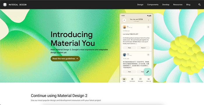
Google and Apple companies have different design guidelines or so-called Design Guidelines. on Android devices it refers to Material Design from Google, and Apple refers to the human interface guidelines.
Material Design https://material.io/

Human Interface Guidelines

Comparison


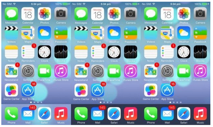
The above is a comparison of the user interface of iOS 7 and iOS 14, we can see the Apple company have the characteristic of the user interface, like icon, layout, size, and style.


if we see comparison android from the old version until the early version has a very significant difference, like icon shape, font style, and layout placement. and of the two designs above we can conclusion that apple design is very consistent.
Different in Apps


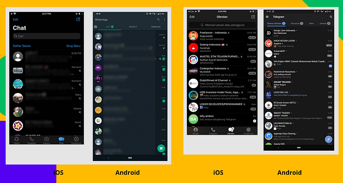
if we take a quick look at these differences, there are no significant differences from android and iOS applications, but if we look in detail there are some differences, one example is the default component.
Default component

and the last, One major factor for the difference in apps is that users of a particular platform get used to using apps a certain way and expect all the apps on that platform to have a certain degree of similarity in usage, so it’s easy to use, intuitive for the users.
